


Context
Designworkout + Almetpublicart laboratory, which provided the framework for the development of city navigation for residents of Almetyevsk and tourists.

The laboratory was conducted under the guidance of the Designworkout educational project and design school founded by designer Dmitry Barbanel in 2010. He is also one of the founders of the «Masterskaya» design bureau, which has been operating since 1990. Dmitry and his colleagues designed projects for VDNKh, Gorky Park, the Pushkin Museum, the General Staff Building of the Hermitage, Moskino cinemas and many other institutions.
In the process, a team of designers developed navigation through the public art objects of the «Tales of Golden Apples» program in Almetyevsk under the close supervision of the Designworkout instructors. The navigation was supposed to simplify orientation in the city and help anyone create a route through the art object locations.
One of the concepts for creating navigation was that it would not be tied to the formal criteria of «museum», «beautiful house», «cafe» or «art object». On the other hand, it would take place through the consistent disclosure of the essence of the city, culture, language, since they are the key features of any place. It turns out that in addition to orientation, navigation also performs a cultural and educational function, anticipating a person's encounter with an art object.

Examples of artistic navigation objects in the world.
The laboratory was conducted under the guidance of the Designworkout educational project and design school founded by designer Dmitry Barbanel in 2010. He is also one of the founders of the «Masterskaya» design bureau, which has been operating since 1990. Dmitry and his colleagues designed projects for VDNKh, Gorky Park, the Pushkin Museum, the General Staff Building of the Hermitage, Moskino cinemas and many other institutions.

In the process, a team of designers developed navigation through the public art objects of the «Tales of Golden Apples» program in Almetyevsk under the close supervision of the Designworkout instructors. The navigation was supposed to simplify orientation in the city and help anyone create a route through the art object locations.
One of the concepts for creating navigation was that it would not be tied to the formal criteria of «museum», «beautiful house», «cafe» or «art object». On the other hand, it would take place through the consistent disclosure of the essence of the city, culture, language, since they are the key features of any place. It turns out that in addition to orientation, navigation also performs a cultural and educational function, anticipating a person's encounter with an art object.
One of the concepts for creating navigation was that it would not be tied to the formal criteria of «museum», «beautiful house», «cafe» or «art object». On the other hand, it would take place through the consistent disclosure of the essence of the city, culture, language, since they are the key features of any place. It turns out that in addition to orientation, navigation also performs a cultural and educational function, anticipating a person's encounter with an art object.

Examples of artistic navigation objects in the world.

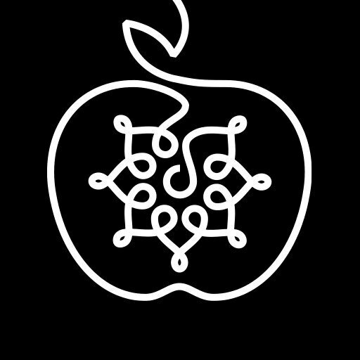
Sketch of navigation object 1.
Process
In November 2020 (a month before the launch of the laboratory), public art programs announced an open call for designers on social media. Within a month, the program team studied the designers' applications and portfolios, and in December the laboratory began its work.
The laboratory consisted of an introductory lecture from curators Vladimir Kolomeytsev, Dima Barbanel and Egor Kiselyov, seminars, online tours of Almetyevsk art objects and the participants' independent work.
The laboratory consisted of an introductory lecture from curators Vladimir Kolomeytsev, Dima Barbanel and Egor Kiselyov, seminars, online tours of Almetyevsk art objects and the participants' independent work.

Avant-garde fonts with letters of the Tatar alphabet. 1920s.

A modular ruler of the Tatar alphabet, designed specifically for the laboratory by Vladimir Kolomeytsev.

First, the participants studied the existing tour routes through the «Tales of the Golden Apples» art objects, people's popular paths, panoramic photos and videos in mural locations. All this was necessary to determine which navigation objects are needed in Almetyevsk and where they should be placed, e.g., on buildings and free-standing structures.
For navigation, it was also important to develop a Tatar language font that reflected the republic's identity and would subsequently be associated with Almetyevsk and art objects in written culture. A unique font is the face of any location. Usually, when fonts are developed, the primary focus is on Russian or English languages. Tatar is an extra feature and its linguistic features are not taken into account. Therefore, the laboratory participants had a goal – to highlight the main features of Tatar writing and draw letters that do not exist in Russian or English.
Each participant drew their letters using a ruler with different geometric modules – it was created by curator Vladimir Kolomeytsev especially for our laboratory. Then, in the joint workshops, the letters were combined, and so, through gradual joint efforts, the Almetica Typeface font was created. It is a collection from the best characters of each project participant. The font is built on modules characteristic of Tatar writing, which helps maintain figurative and semantic integrity. The final version is partly inspired by books on Tatar writing from the avant-garde period of the 1920s.
Pedestrian decision points were designed by lab participants. Each circle is 1 kilometer in diameter. It's an about 15-minute walk from one end to another.
First, the participants studied the existing tour routes through the «Tales of the Golden Apples» art objects, people's popular paths, panoramic photos and videos in mural locations. All this was necessary to determine which navigation objects are needed in Almetyevsk and where they should be placed, e.g., on buildings and free-standing structures.

Pedestrian decision points were designed by lab participants. Each circle is 1 kilometer in diameter. It's an about 15-minute walk from one end to another.
For navigation, it was also important to develop a Tatar language font that reflected the republic's identity and would subsequently be associated with Almetyevsk and art objects in written culture. A unique font is the face of any location. Usually, when fonts are developed, the primary focus is on Russian or English languages. Tatar is an extra feature and its linguistic features are not taken into account. Therefore, the laboratory participants had a goal – to highlight the main features of Tatar writing and draw letters that do not exist in Russian or English.

Avant-garde fonts with letters of the Tatar alphabet. 1920s.

A modular ruler of the Tatar alphabet, designed specifically for the laboratory by Vladimir Kolomeytsev.
Each participant drew their letters using a ruler with different geometric modules – it was created by curator Vladimir Kolomeytsev especially for our laboratory. Then, in the joint workshops, the letters were combined, and so, through gradual joint efforts, the Almetica Typeface font was created. It is a collection from the best characters of each project participant. The font is built on modules characteristic of Tatar writing, which helps maintain figurative and semantic integrity. The final version is partly inspired by books on Tatar writing from the avant-garde period of the 1920s.

Almetica Typeface font.

Sketch of a sign made from gas pipes.
They decided to make navigation objects out of pipes. They represent a connection to the city's oil-related history, ease and economy in production, adaptability to different text sizes, and an aesthetic reference to the Arabic script – the rounded, flowing lines. Until 1927, Tatar was written in Arabic. The shapes of pipe objects proposed by the participants use the same modules as the Almetica Typeface font.
Due to various difficulties, the navigation developed by the participants is not yet implemented in Almetyevsk and remains in sketches only.
Due to various difficulties, the navigation developed by the participants is not yet implemented in Almetyevsk and remains in sketches only.

Sketch of a sign made from gas pipes.
The process of creating and sketching a navigation object for the «Reconstruction of the Sky» mural

Map of meanings and visual codes of the art object.

Sketch of a navigation object for the «Reconstruction of the Sky» mural.


Map of meanings and visual codes of the art object.

Sketch of a navigation object for the «Reconstruction of the Sky» mural.

Authors
CONTACT US
© Street Art Research Institute
Made by Gonzo Design
Banking details
ООО «ТЕОРИЯ И ПРАКТИКА УЛИЧНОГО ИСКУССТВА»
ИНН: 7810474682
КПП: 784201001
ОГРН: 1167847291545
ОКПО: 03512611
ОКВЭД: 90.0 (Деятельность творческая, деятельность в области искусства и организации развлечений)
Расчетный счет: 40702810455160005262
Банк: СЕВЕРО-ЗАПАДНЫЙ БАНК ПАО СБЕРБАНК
БИК: 044030653
Корр. счет: 30101810500000000653
Юридический адрес: 191040, Санкт-Петербург г, Лиговский пр-кт, дом 50, литера Н, помещение 16-Н офис № 56
Телефон: 401-44-90
Генеральный директор: Фиева Полина Григорьевна